Sommaire
No more whites, the rise of a new Scandinavian trend
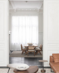
After the pure and cool shades of white and gray that have been ubiquitous in recent years, color is again becoming increasingly important. While a few years ago interiors were often a blank canvas, designers are turning to color to give our homes a more cozy atmosphere. Even in the trendsetting Nordic countries, with their love of light and almost entirely white walls, color has been on the rise. Norwegian paint brands such as Jotun have recently expanded their catalogue with new colors, such as the intriguing grey-green Exhale. Nowadays we crave warmth and a sense of comfort, characteristics that are not associated with a clinical and hard white color.

Jotun

Jotun
A longing for comfort in interiors with muted colors
We don’t have to look far to find the reason behind this shift in color preference. The intense and prolonged pandemic period has left an ineffable impression on all of us. The lockdowns, with a mandatory retreat into our home as an inevitable consequence, have made us cherish our home more than ever. We are also attaching more importance to a sense of wellness. By this we not only mean a physical sense of well-being, but also a mental state of relaxation and inner peace. We find this inner peace abundantly in nature. That is why soft and muted versions of beige, brown, green and earth tones, ranging from yellowish ocher to rust brown, are finding their way, not only to our wardrobe, but also to our home.
The new neutrals are setting the tone
For everyone who does not feel comfortable with all too many bold colors in their interior, neo-neutrals are the perfect solution. These complex shades are created by adding a little more color to classic neutrals. Reassuring injections of yellow, brown, green and red that feel very natural are increasingly in vogue. Think of the colors of raffia, untreated wool or soft suede, shades that ooze warmth.
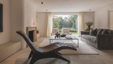
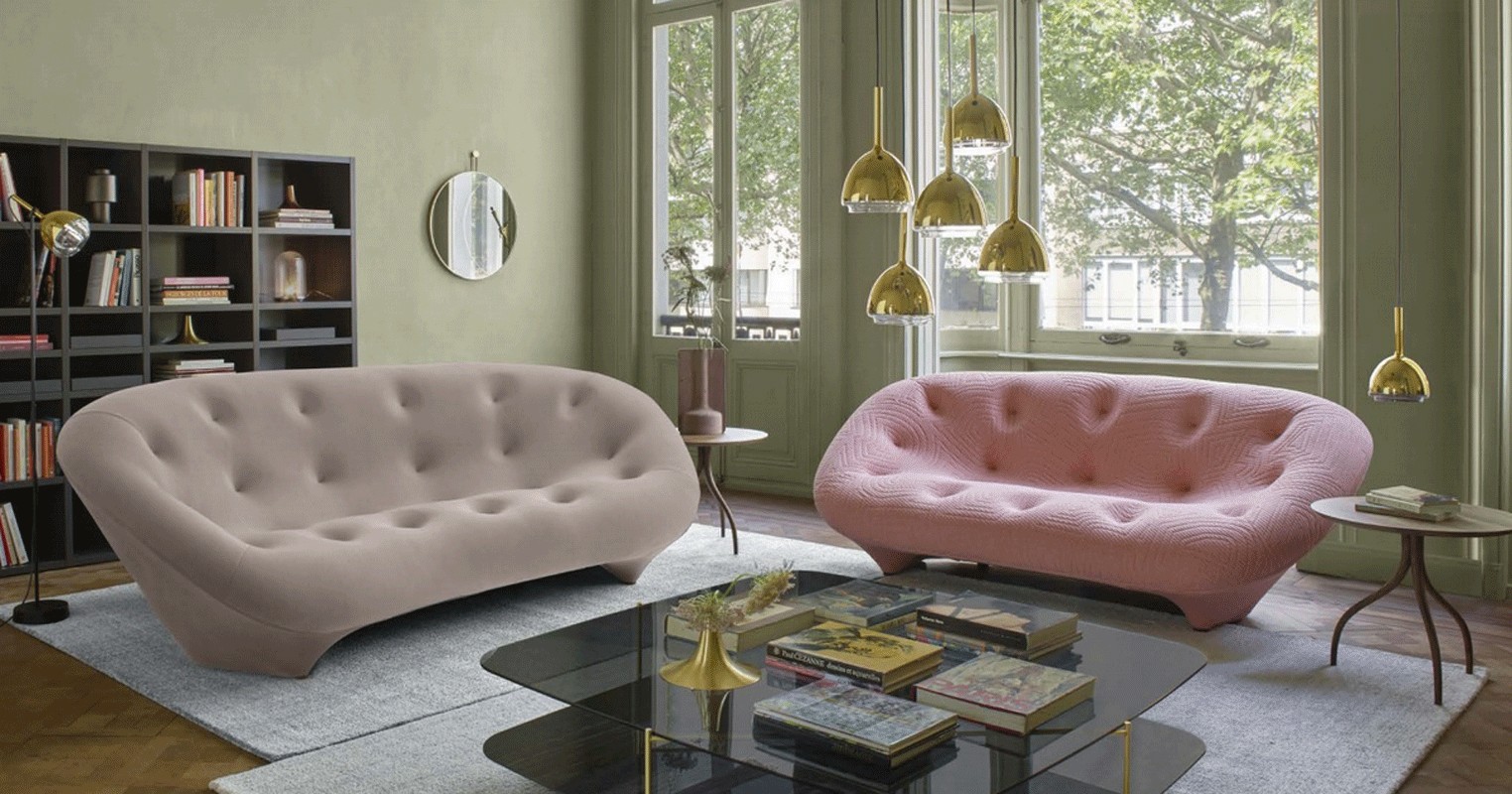
Femininity as an interior muse
These kinds of hues also distinguish themselves from the previous prevailing color palette by their femininity. The feminine body with its sensuality and soft curves is a contemporary muse for countless interior designers and furniture brands. We see this not only in the current colors, but also in the rounded shapes and tactile materials that are characteristic of contemporary furniture and fabrics. Hard corners, straight lines and cold colors have become outdated. An example of this trend is the Soufflot couch designed by Jean-Philippe Nuel for the French furniture company Ligne Roset, which is available in a tactile, warm pink fabric.

Jotun
Brown is the new black
The statement “When in doubt, choose black” is no longer valid. Black is increasingly being replaced by brown in all its different facets. The same goes for their derivatives. Cool gray tones make way for warmer stone colors that look less harsh and radiate cosiness. But we are not talking about the classic beige, the new neutrals always carry a hint of yellow, green or red. These snug shades immediately create a comfortable atmosphere to any room, whether it is a kitchen, bedroom or living room, such as Jotun’s Humble Yellow, a beige hue with a yellow base.
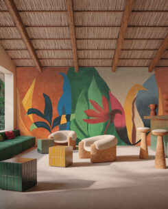
Shades of green inspired by nature
In addition to brown, green has also fully arrived on the scene as a new neutral color. Its popularity is hardly surprising, as the color green represents tranquility and nature par excellence. The greens of 2022 often have yellowish and brown influences and are reminiscent of Mediterranean olive trees. They are quiet shades, which keep far away from the bright green of apples or grass and contrast beautifully with contemporary reds. Bathroom furniture brand Detremmerie, for example, chose a yellowish green for their No Limit Round collection, which immediately creates a sense of warmth and serenity. The combination of these two color groups is therefore all around nowadays, albeit always in muted versions that evoke a feeling of relaxation and comfort. There is no place for harsh contrasts in today’s interior design.

Jotun
Reds and yellows as accent colors
Now that the end of the pandemic may be near, the world is yearning for joy and optimism. The pre-eminent color associated with these peppy characteristics is, without a doubt, yellow. Although this time we’re not talking about the green-yellow citrus tones that were all the rage in the 2000s. In contemporary interiors we mainly see muted, warm variants such as mustard, ochre and curry. As far as the current shades of red are concerned, we see on the one hand many brown-orange hues, with terracotta as its leading lady. Deep, sensual wine colors also make an appearance, even in the bathroom. In addition, lighter shades of pink are also strongly represented, albeit a warmer variant with a rather yellowish undertone, instead of the fresher millennial pink that was ubiquitous a few years ago. All these shades are often combined together, with white being replaced by a warmer beige hue, to create an utterly warm and cozy effect. Golden accents, such as the Brass Bell lamps by Patrick Zulauf for Ligne Roset offer the finishing touch.